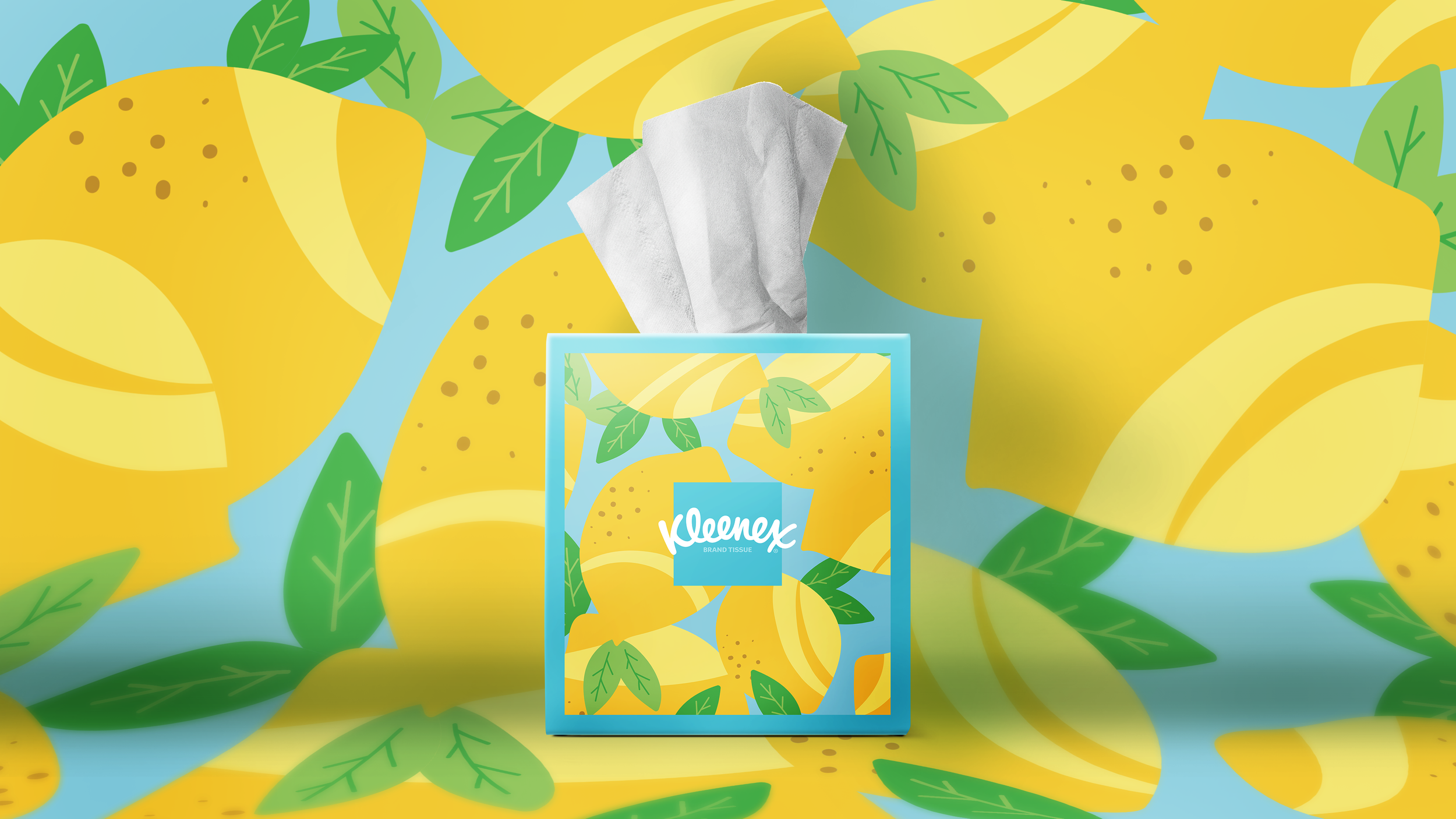
helping an iconic brand take back a place of distinction in their category & our homes
why
To set Kleenex apart in a category that has become a wash of indistinguishable options, inspiring users to put more Kleenex boxes in more places in their homes.
how
By using design to shake up the category with an unmistakably Kleenex print and pattern strategy that carries the brand identity beyond the shelf, into your home.
what
A modern and consistent illustration style that embodies Kleenex’s brand values, and a new iconic asset — The Frame — that shines a light on the Kleenex logo.
my role
I completed this work while I was the Creative Director at Design B&B. In this case that meant handling our client relationship (the kindest people), leading our internal design team (fun and talented), and managing a complex project timeline to meet our production deadline with more than 60 brand new motifs across a range of pack formats (wild but worth it). I love when I get to see the work through from early strategy all the way to the shelf, with all the ups and downs along the way. This project was an amazing opportunity to do that.
credits
client Kimberly-Clark
agency Design B&B
core team Amy Brusselback, Sammy Smith, Jenna Zelkowski, Ellie Schwartz


